Building a Brand Through Illustration & Design
Our design and illustration work provided Ozark Hills Winery with a strong and consistent brand identity that extended across all aspects of their business.
Key Improvements Made

Created a unique and memorable logo.

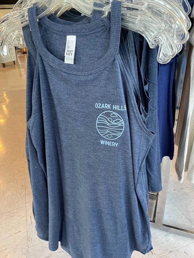
Designed a cohesive visual identity for the brand.

Illustrated and designed 12 impactful wine labels.

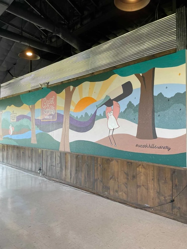
Designed packaging, signage, and a mural to enhance the customer experience.

Established a brand look and feel that was successfully extended to a large-scale tourism campaign.
Challenge
As a brand-new winery, Ozark Hills Winery needed to establish a distinct visual identity from the ground up. They approached us with a key need for impactful illustration to define their brand, enhance their wine packaging, and contribute to an inviting and memorable atmosphere for their customers.
Solution
We developed a complete brand experience for Ozark Hills Winery, focusing on illustration and design to create a cohesive visual identity.